
Payslip Consumer Research For Native App
Some screens and steps are concepts to protect IP.
General Overview
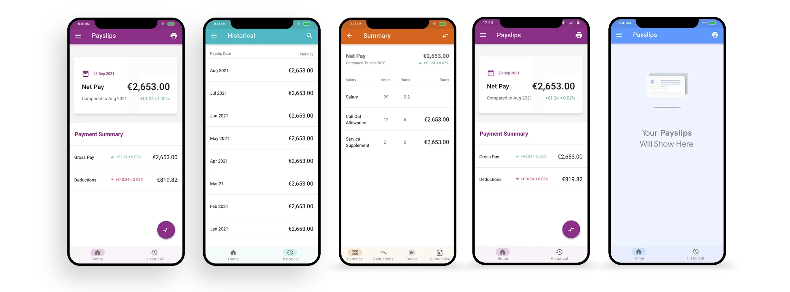
The payslip section of the Access native app is one of the few features available to most users, regardless of tiers or packages.
For the most part, payslips along with a few other HR basics, booking time, and team calendars are the primary experience for a large percentage of all users.
This is an employee self-service feature which allows users to manage all aspects of a historically paper payslip.
Users expect to be notified of payslip delivery, clearly understand the components of a payslip, and be able to view, search, and print all payslips to date.
Considerations included application speed, communication between other functions and payslips, notifications, and printing.
Roles & Responsibility
I primarily worked on research gathering and interviewing, then partnered with UI designers afterwards. In practice, though, you have to wear many hats and I often supported the physical design work as well as roadmap thinking.
Problem Statement
Previously, too much attention had been given to the user interface. This design debt left users frustrated with what should have been a simple and specific experience.
Research and feedback showed that users found it difficult to identify what the current payslip was versus a previous one. They also saw the lack of a printing option as a major oversight.
The user interface was too complex and the user experience was too basic. This needed to be reversed.
Users & Audience
To start, we identified the potential users of a payslip function and grouped them into personas.
I will only use a single persona for brevity. In practice, several would be created alongside a company persona.
- Basic Consumer - A typical employee who may not have access to any other features.
- Occasional Monthly User - Only looks at their payslip if there is a problem with salary hitting their bank.
- Notification Driven Transaction - Likes to be notified that there is a new payslip to avoid opening the app unnecessarily.
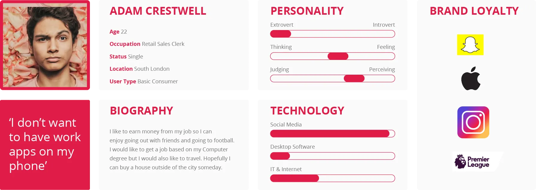
How This Persona Was Created
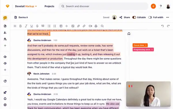
To start, we identified the potential users of a payslip function and grouped them into personas. I like to conduct several user interviews, ideally between 5 and 10 per persona.
I prefer to record interviews where permitted and use a tool like Dovetail to analyze sentiment and content afterwards. Dovetail can help with some of this work, but I always review the transcript myself.
With detailed analysis of a user group, it becomes much easier to synthesize large data sets into clear archetypes.
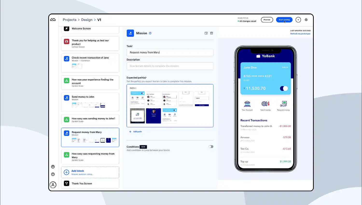
Maze A/B Testing
We created many small user tests based on high-fidelity prototypes. Through these, we were able to validate most of the decisions we needed to make with test audiences.
This proved very valuable, as we uncovered interactions that had not been considered and which made it into the final product. User testing also reduced cost to serve because it removed debate about the facts.
The results were shared with key stakeholders as proof-of-concept validation.
Scope & Constraints
This was a relatively small project with large implications for the business, but we were constrained by the need to keep the application consistent with the wider design system.
We wanted an application that was easy to use but also realistic to build in the time frame. This was not a wheel-reinventing exercise.
The audience included all age ranges and both ends of the tech-comfort spectrum using a native app for payslip management.
Empathy Mapping
Once we understood our users, we drew empathy maps to better understand the emotional connection people have to HR applications.

Conclusions
Understanding the people who would eventually use the product was key from the start. We found that people had very different reasons for wanting their payslips in-app, but they essentially wanted the same outcome once they got there: speed, clarity, and printing.
It was redesigned several times once we better understood the structural importance. It is better to redesign than to build on a mistake.
This case study helped me understand how other companies generate business value through strong UI and UX. It gives me confidence that if we apply similar principles, and keep investing in UX research, our product team can help the company achieve much more in the near future.
Contact
If the brief is complex, that is usually where I do my best work.
Email is the cleanest way to start. The other channels are placeholders for now, but the section is ready for them when you are.